Mardōu
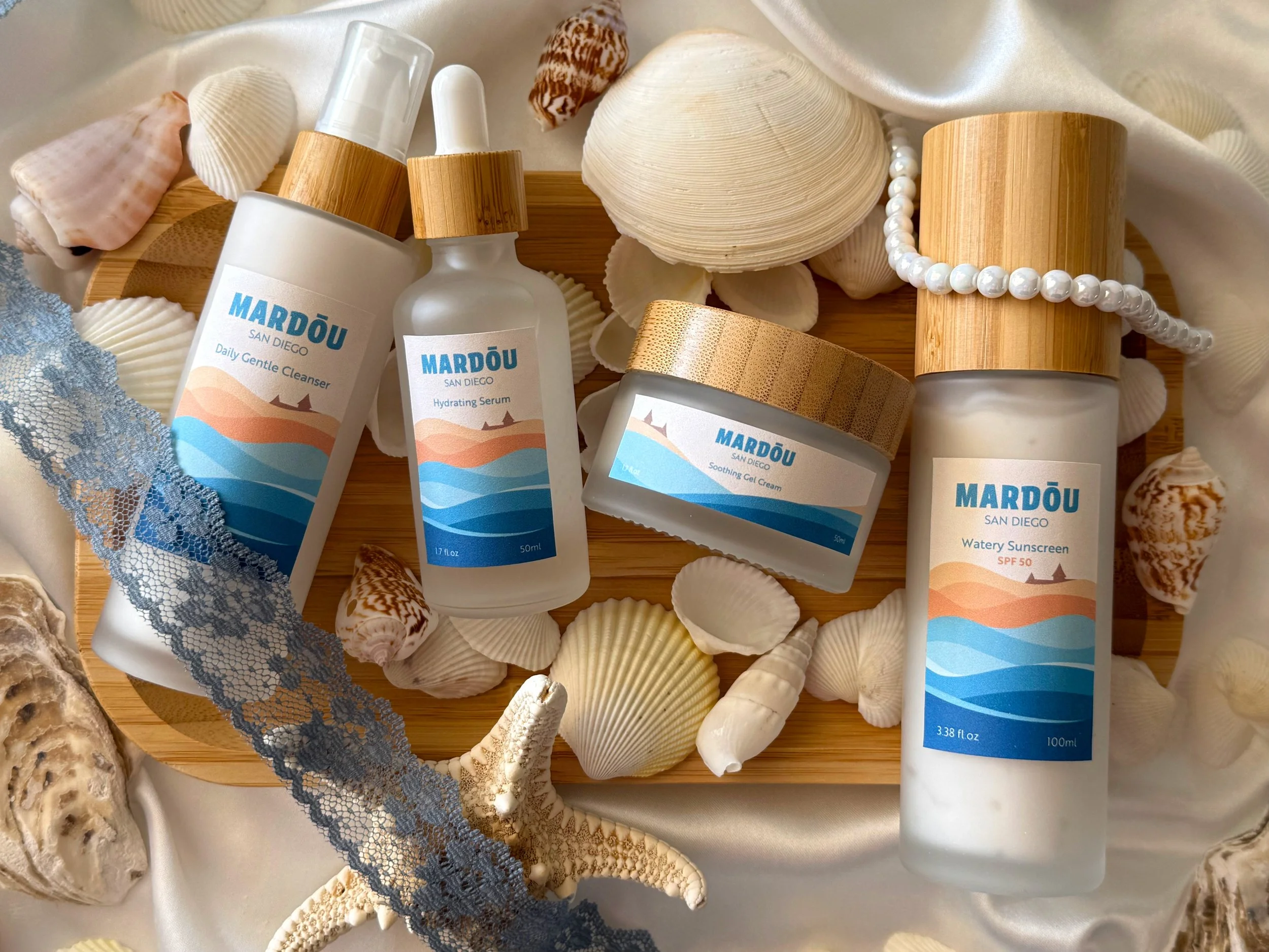
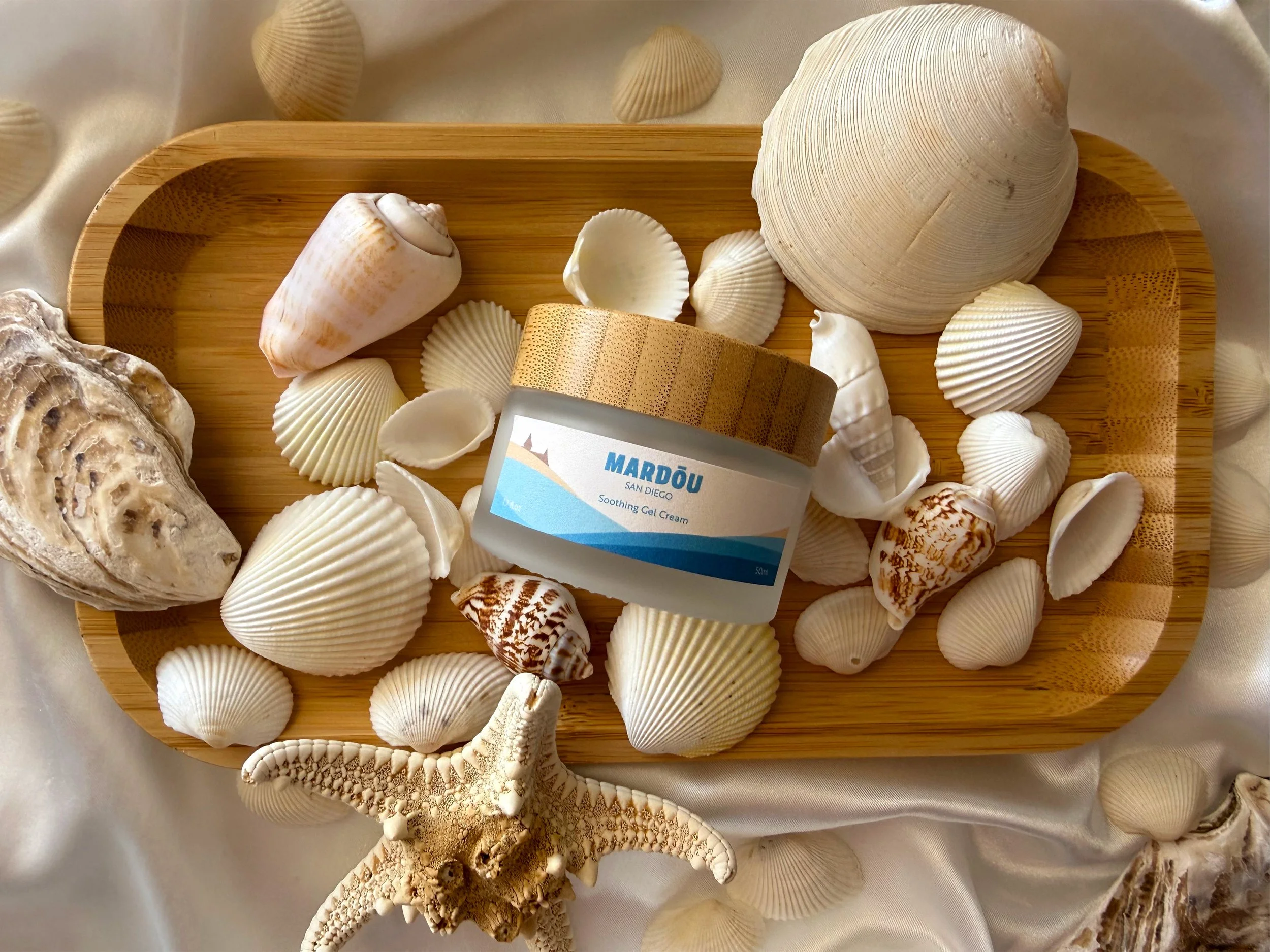
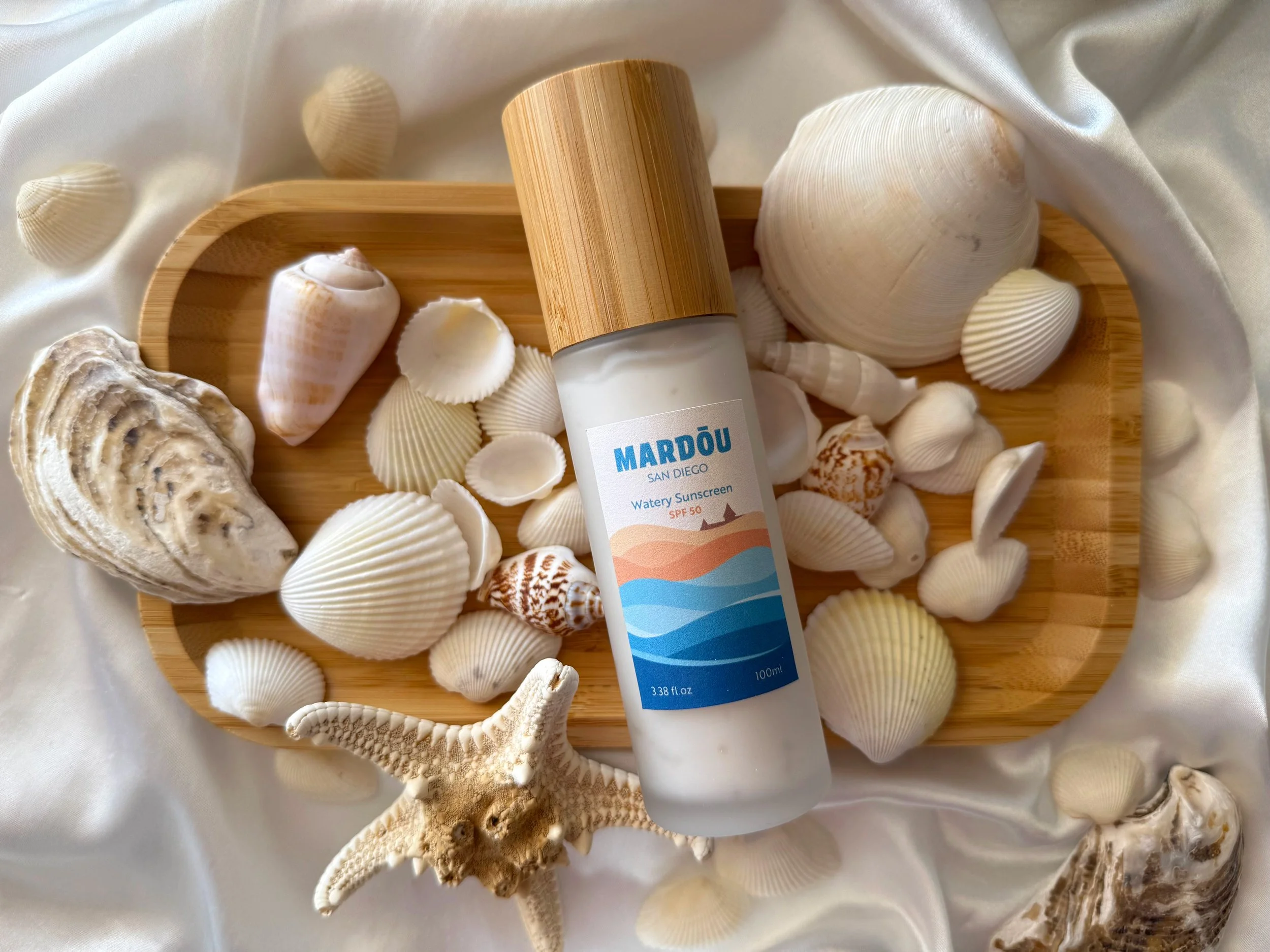
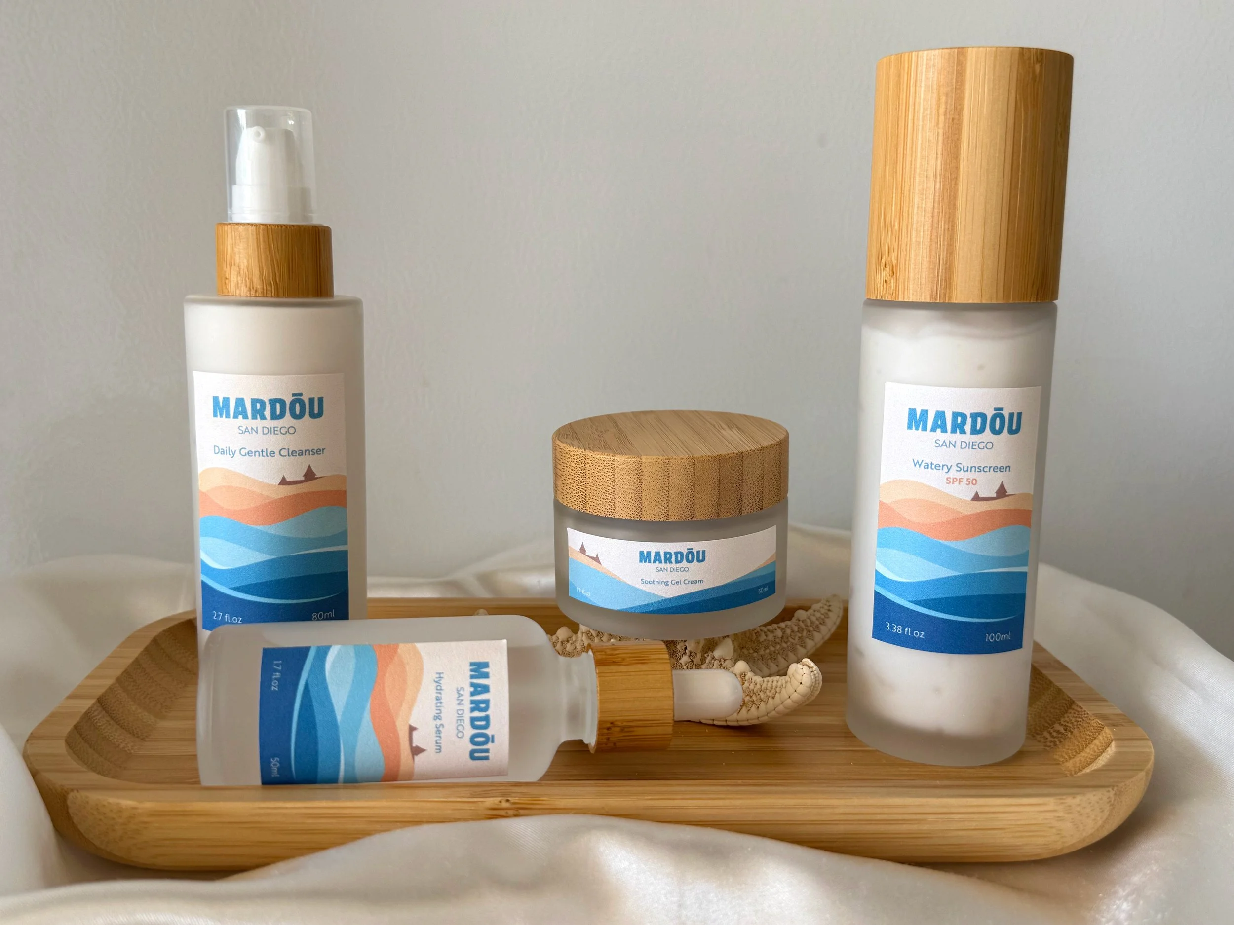
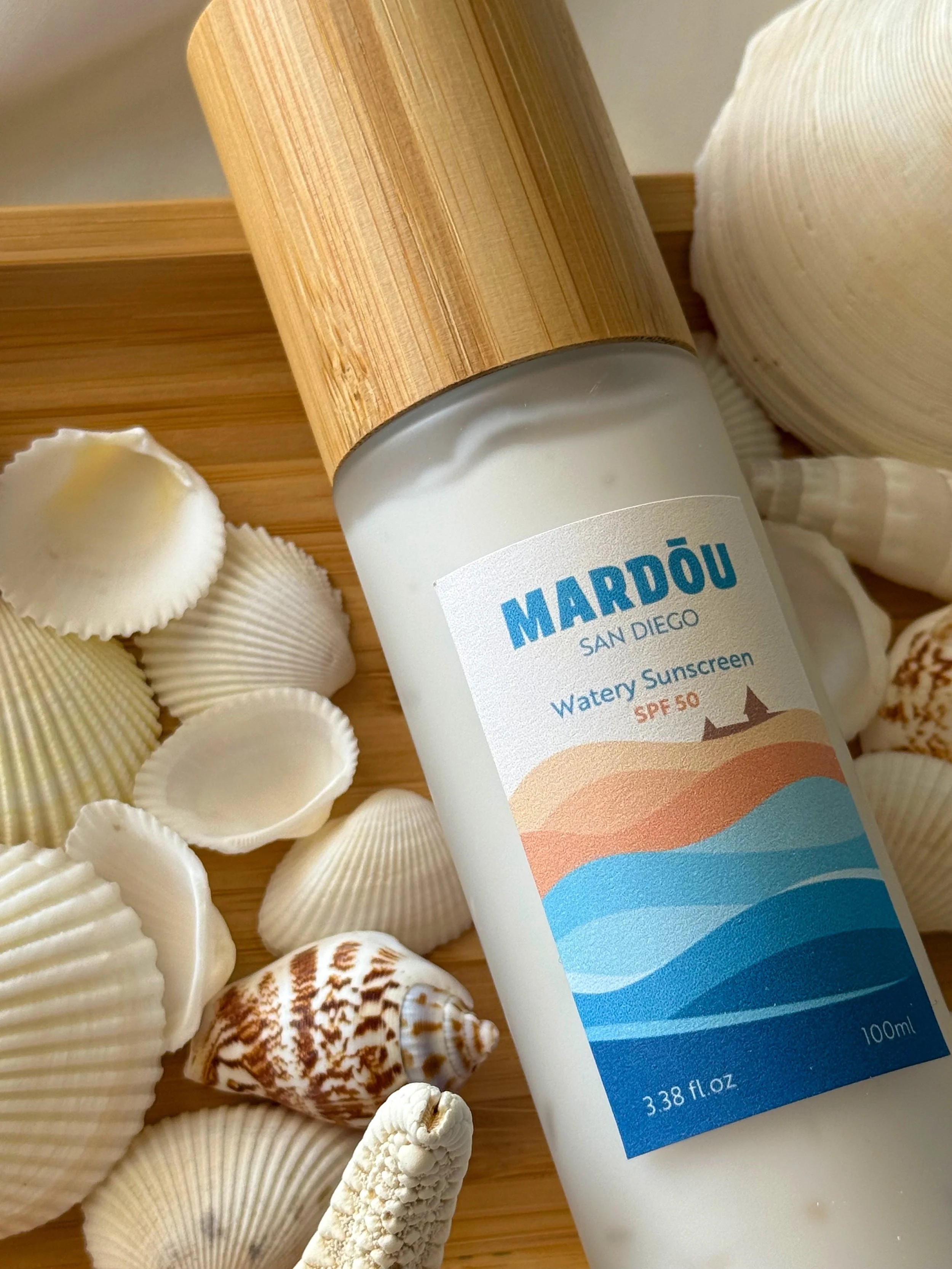
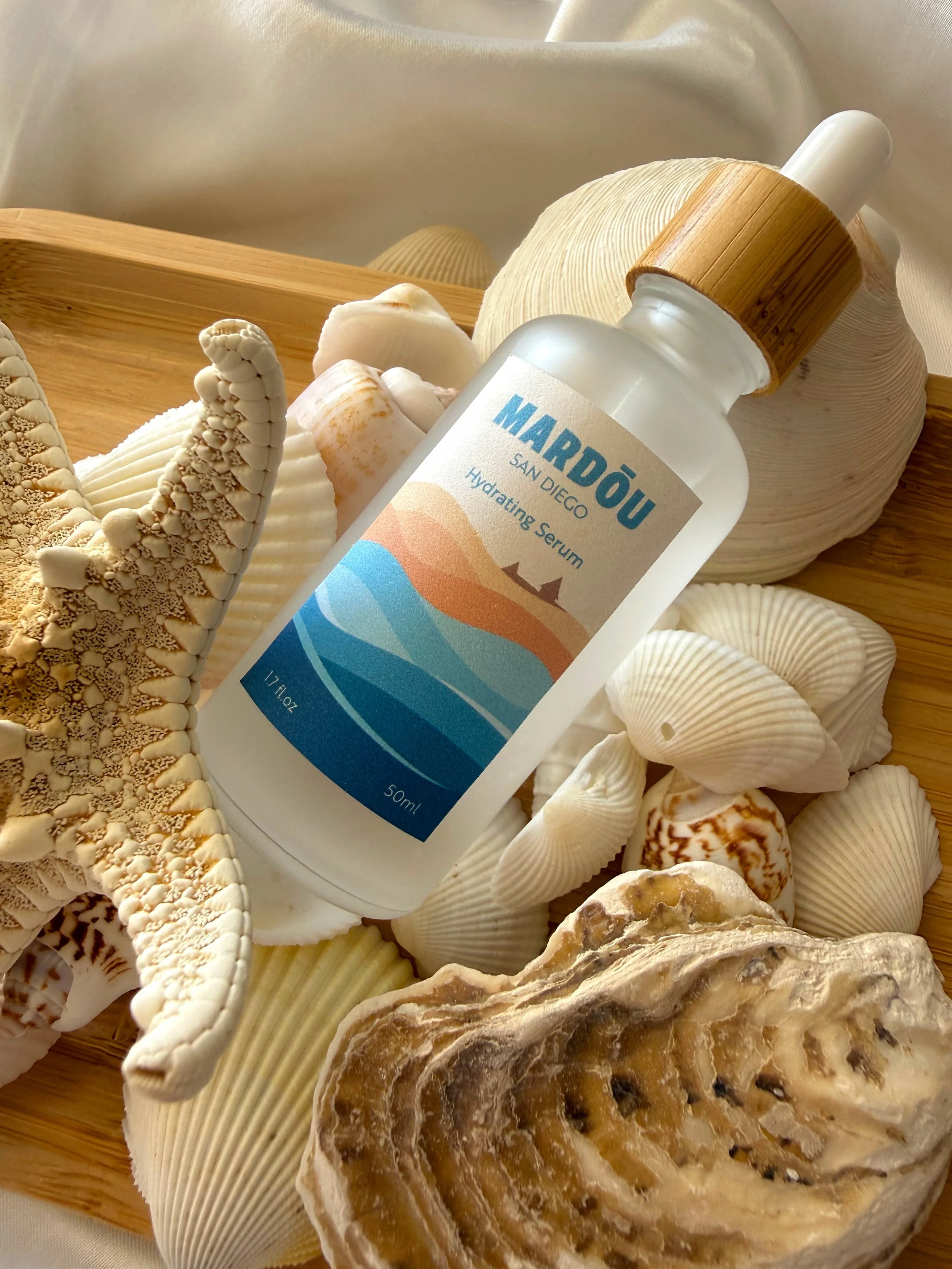
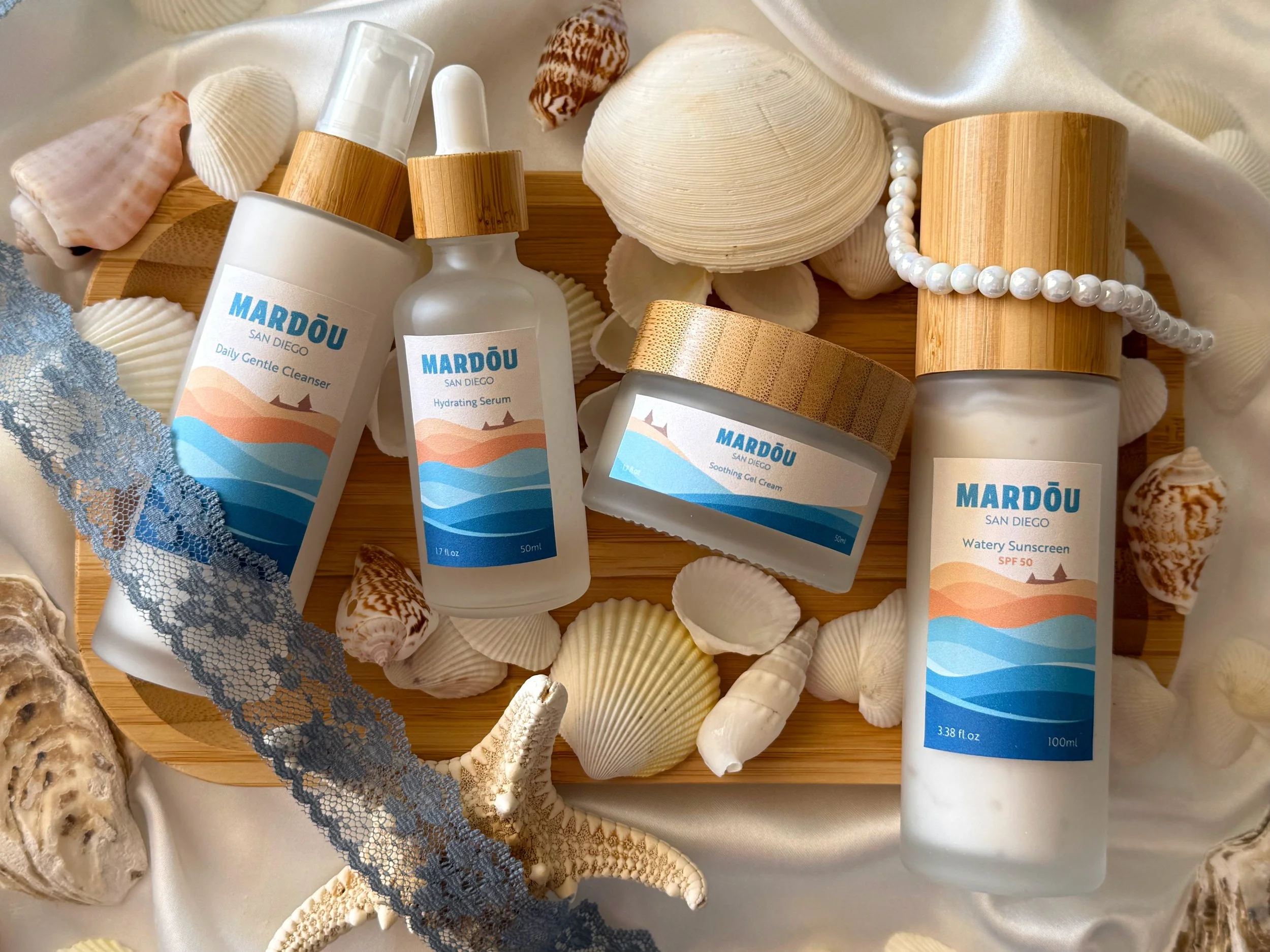
Skincare is something that I’ve been interested in for a number of years now. Seeing all of the different skincare products and their concepts/designs have inspired me to create my own skincare packaging design. Here, I created a simple skincare set that contains the main four products that anyone would use in their day-to-day skincare routine.
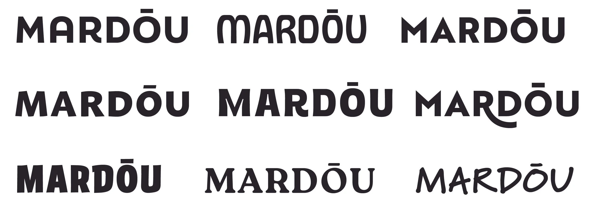
Logo Process
Final Logo
For the logo, I wanted the typeface to have a subtle organic feel to it to match the theme of the ocean. The name “Mardōu” is a combination of two different words: Sea (‘Mar’ in Spanish) and Soft (‘Doux’ in French). Together the name means “Soft Sea”.
Label Process
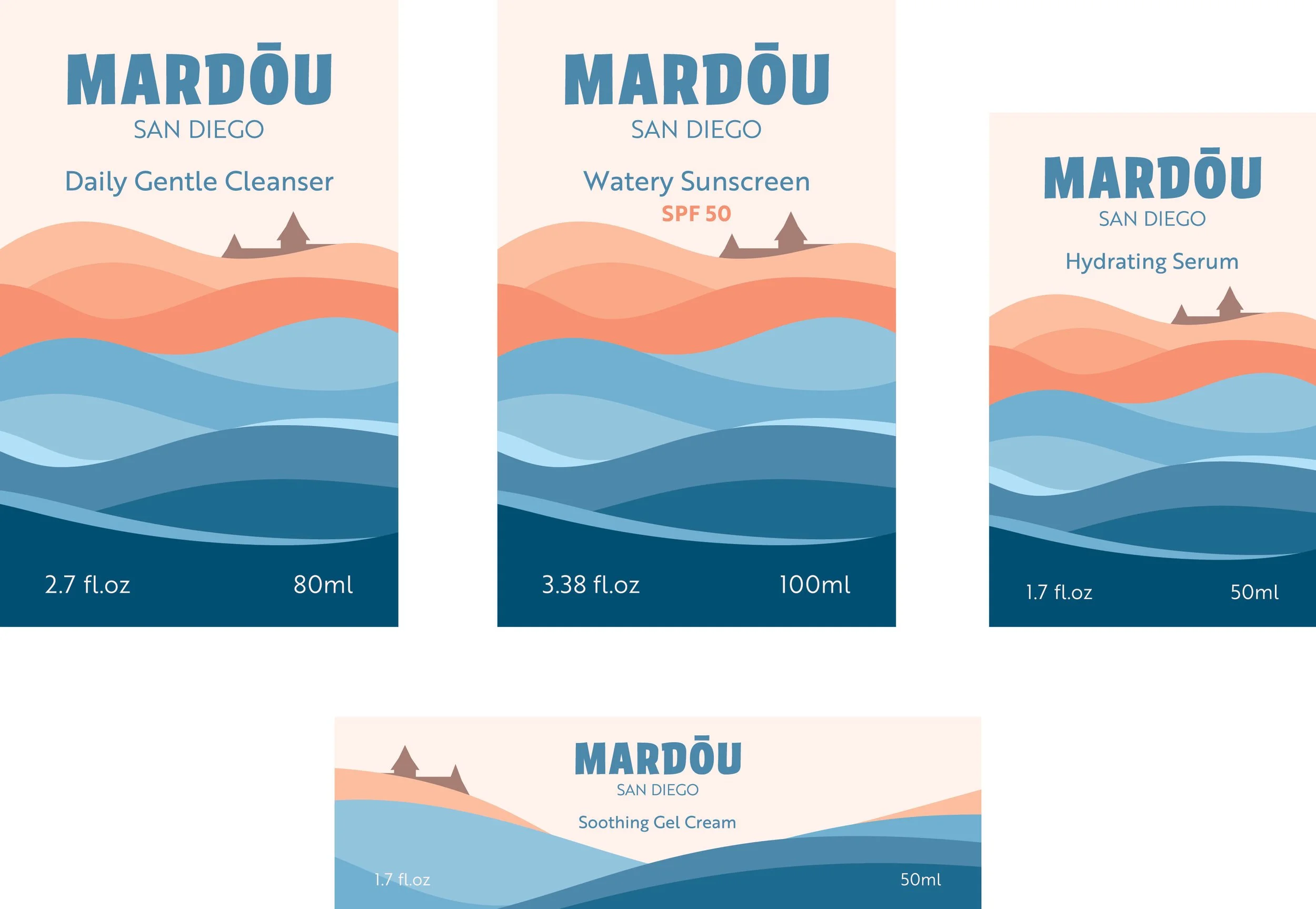
Final Labels
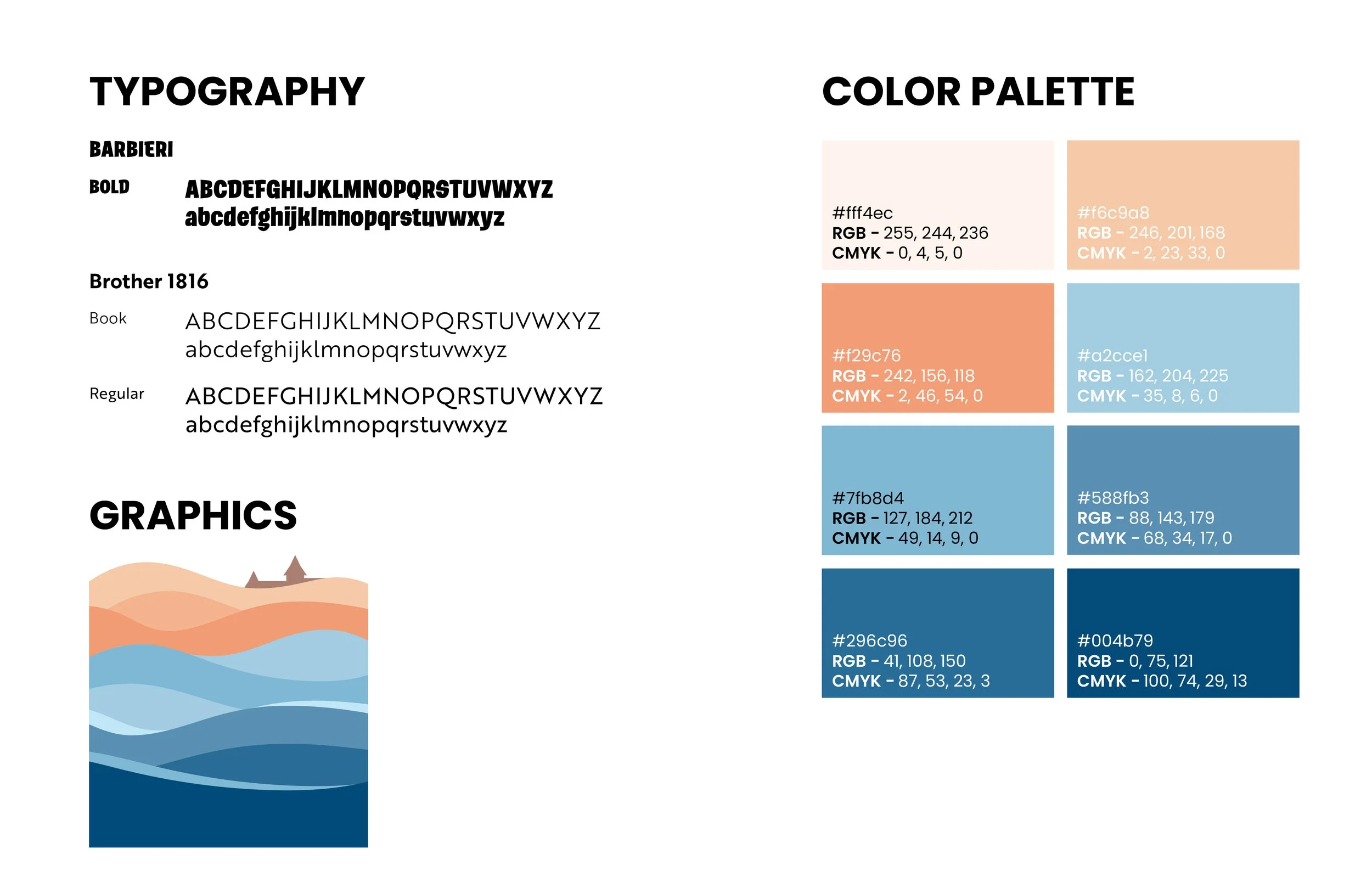
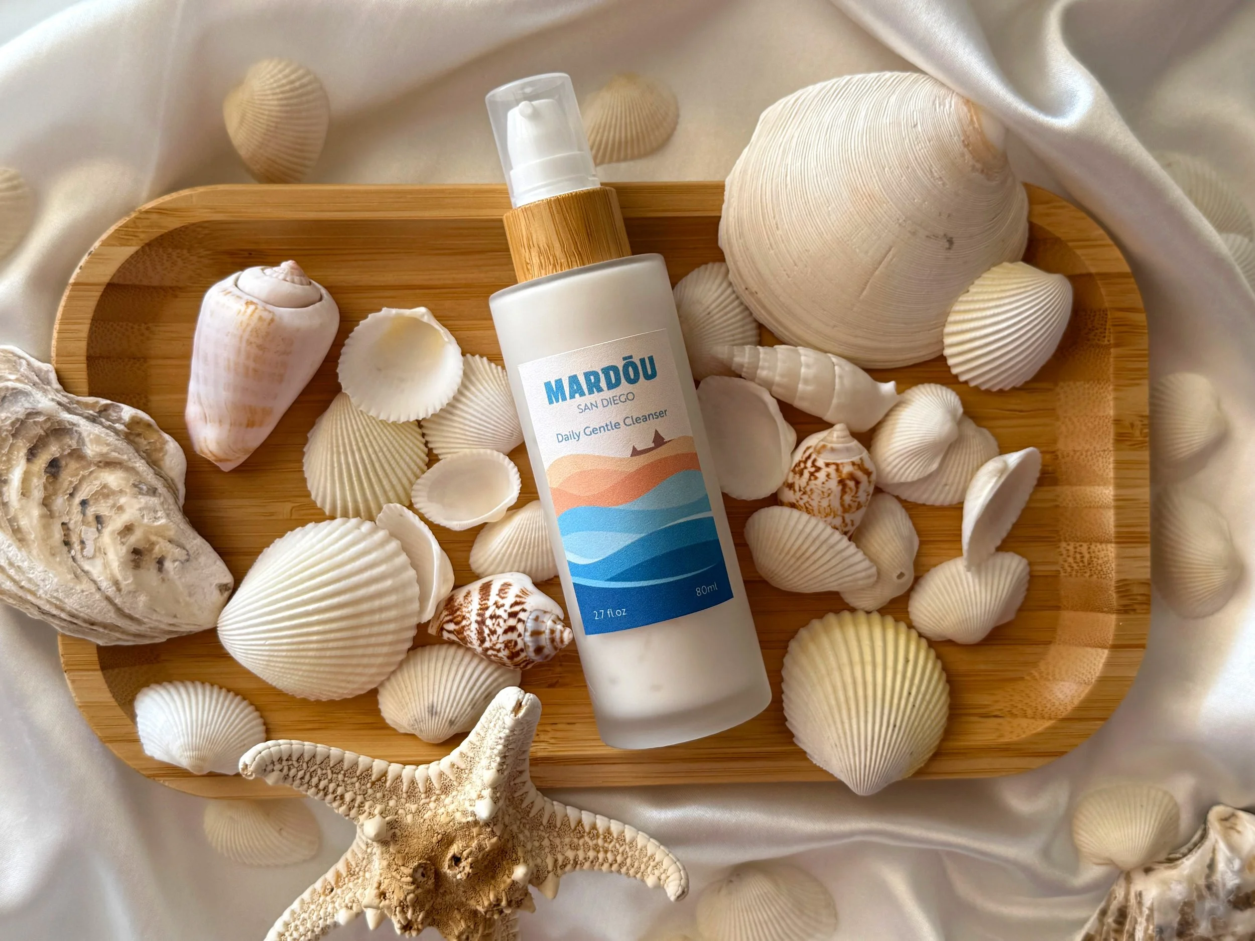
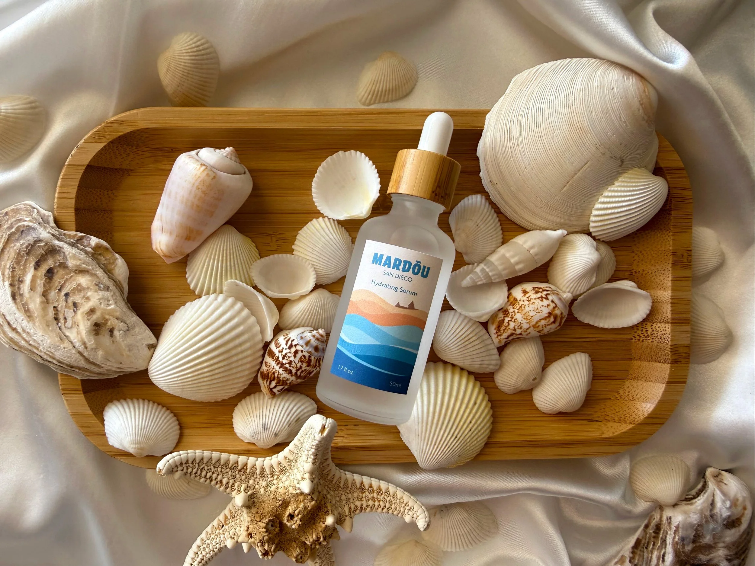
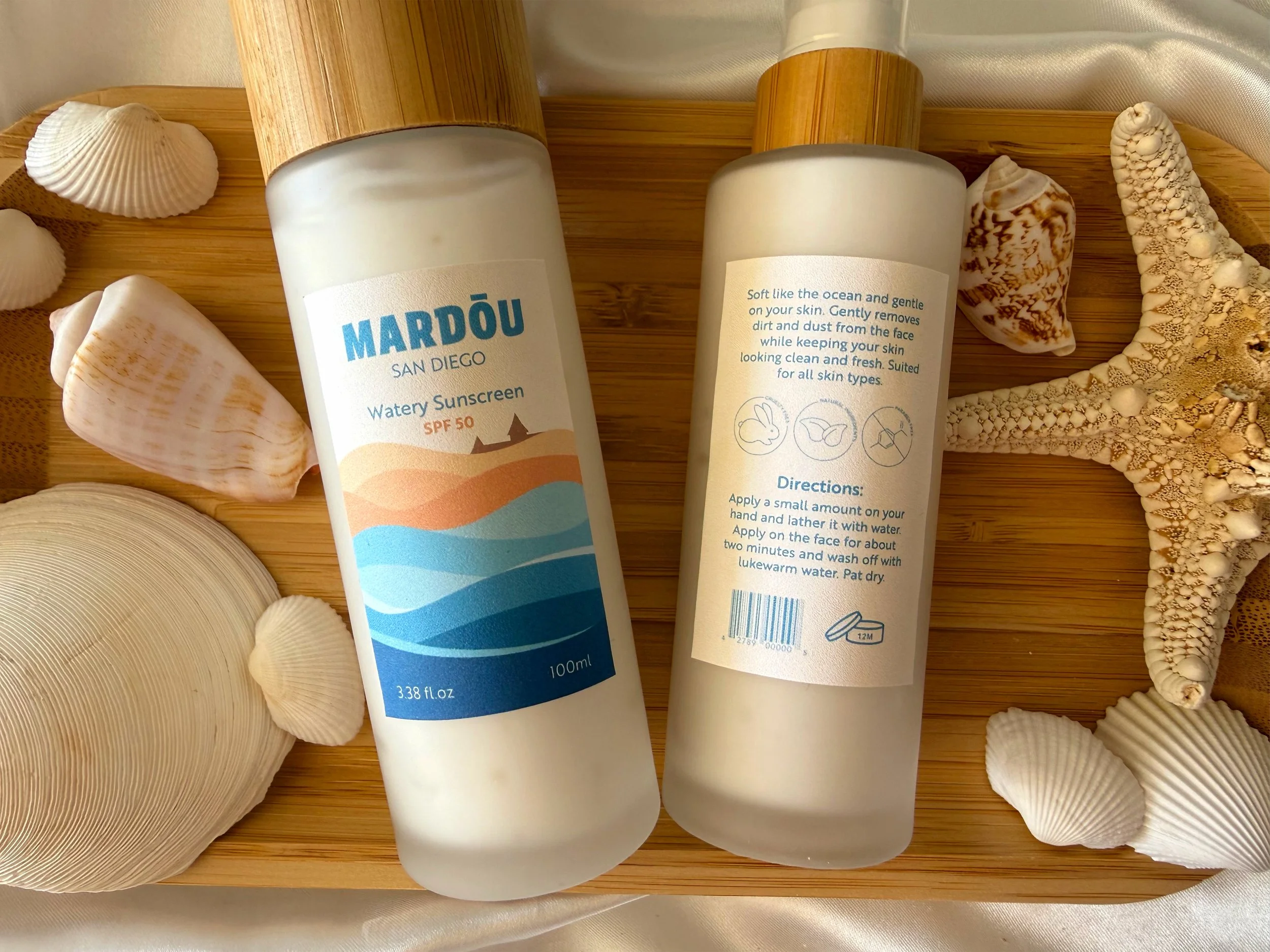
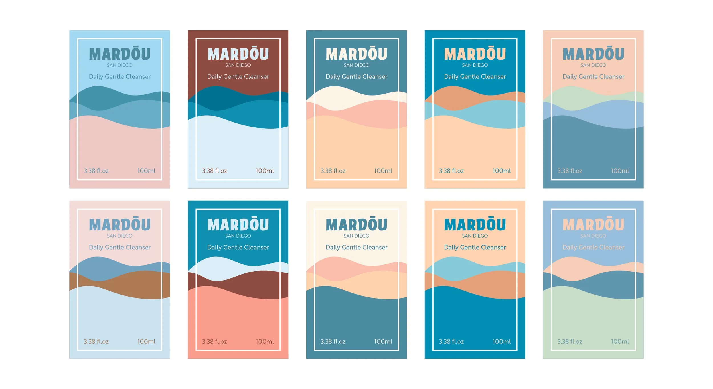
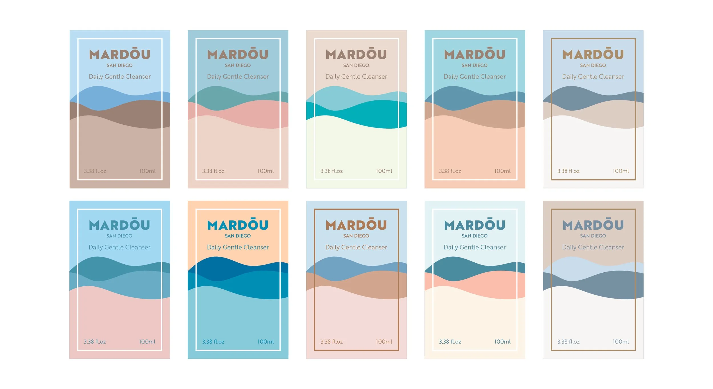
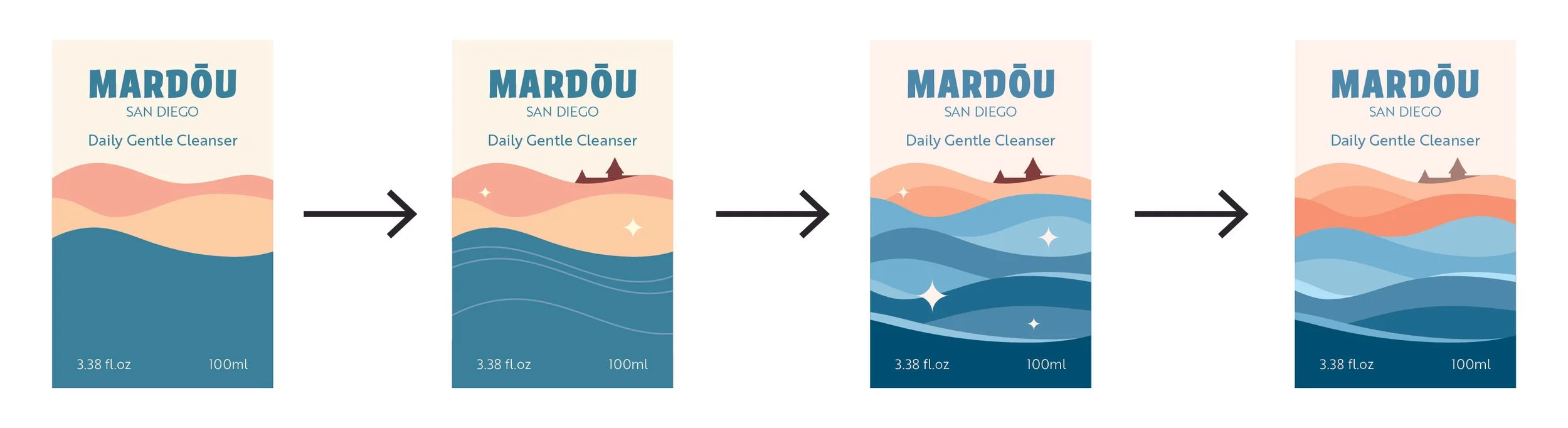
The design of the labels consist of a simple and repeating wave design as the main graphic. I wanted the colors of the water and sand to get darker as they move closer to the foreground to give the design a sense of depth and space. I wanted the colors to be composed of of earth tones, mainly hues of blue, to go with the soft beach theme while also having the orange sand as a pop of color. The size of the labels are altered from one another to appropriately fit its corresponding bottle.
Brand Kit